Communication is important and, by all measures, a critical aspect in business and life. It’s not always easy to explain ourselves, particularly in complex issues where outcomes coming from multi-factor effects or functions.
Generally speaking, improvement is bound with mapping and measurement, no matter if this is science, markets or public policy. In order to have a reliable measurements we need the right context followed by the appropriate tools.
At the lines that follow, we will shortly present how one may present the outcome of multiple variables in complex functions. Usually, motion is more intuitive, however, it should be used at the right combination of scale and dependent variables.
One popular software tool for visualization is ggplot2 in R where in just a few lines we could animate our data.
library(rJava)
library(xlsxjars)
library(xlsx)
library(ggplot2)
library(reshape2)
After loading the libraries our project needs, we load our data set :
datb <- read.xlsx("2017_power_prices2.xlsx", sheetName="Sheet1")
And, sometimes, the effort it takes to prepare the data is more than half of the whole project. A common practice is to create data.frames out of raw data building a structure easy-to-use :
survey <- data.frame(datb$NA..1, datb$NA..2, datb$NA..3, datb$NA..4, datb$NA..5, datb$NA..6, datb$NA..7, datb$NA..8, datb$NA..9, datb$NA..10, datb$NA..11, datb$NA..12, datb$NA..13, datb$NA..14, datb$NA..15, datb$NA..16, datb$NA..17, datb$NA..18, datb$NA..19, datb$NA..20)
survey2 <- melt(datb, measure.vars = c("NA..11", "NA..12", "NA..13", "NA..14", "NA..15", "NA..16", "NA..17", "NA..18", "NA..19", "NA..20"))
Function melt of reshape2 package is useful for visualization with ggplot, particularly when we want to create multi-facet or animated graphs.
img <- image_graph(800, 450, res = 96)

#Create a datalist to use lapply function
datalist <- split(survey2, survey2$Month)

#Use ggplot as function in lapply
out <- lapply(datalist, function(data){
  	  p <- ggplot(data, aes(price..euro.mwh., value, size=Days, color=variable)) +
    geom_point() + ylim(0, 250) +
    ggtitle(data$Months) + theme_classic()
  print(p)
})

dev.off()
animation <- image_animate(img, fps = .25)
print(animation)
In a nutshell, we generate snapshot plots visualized by color and size for each variable and day, respectively. Therefore, our audience focuses on the growth of our graph in time - comparing the values in months and days, for all variables.
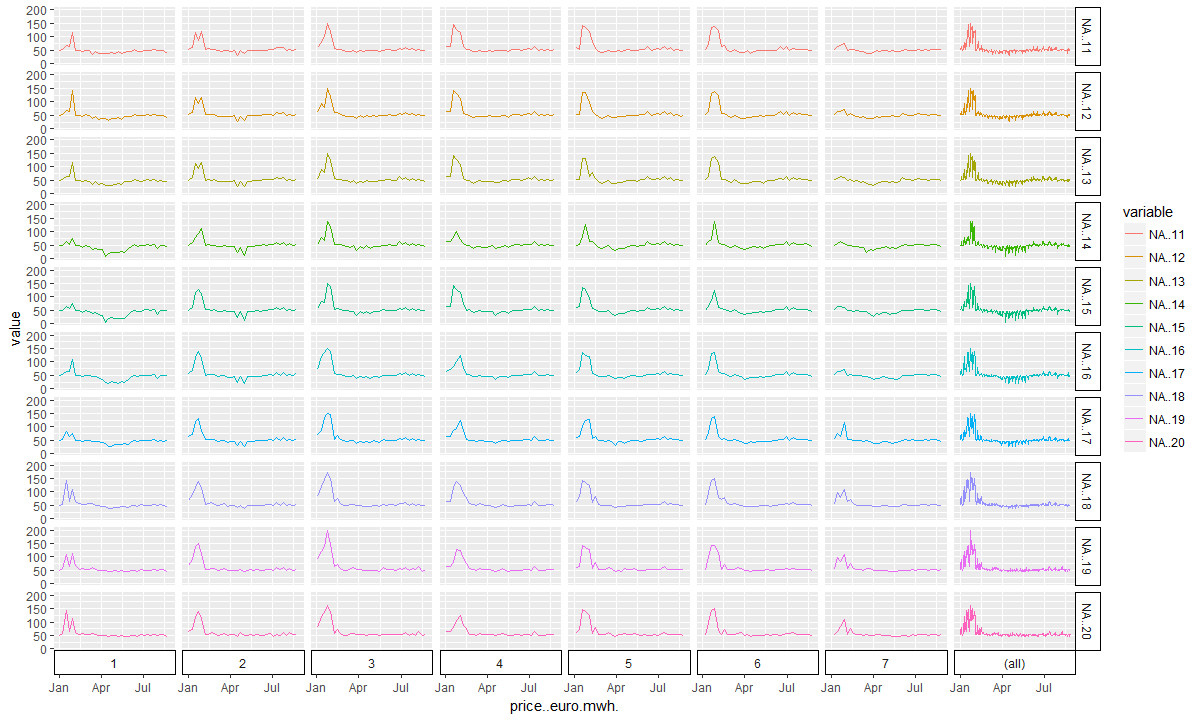
Off course, the same result could be available in a static graph :

However, it’s easy to see that animation is pretty intuitive, especially if it’s combined with static plots.